Mobile Site
ClubExpress websites dynamically adjust themselves for mobile devices such as smartphones and tablets.
When you come to a ClubExpress website using a smartphone for the first time, you will see a screen similar to the following:
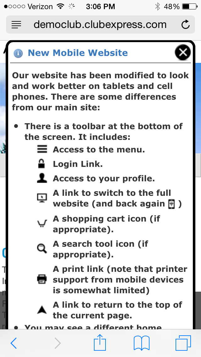
This screen explains how the website works, including the toolbar options at the bottom. Scroll down and click OK to hide this screen and proceed to the website. You will only see it once.
On a smartphone, the main website will look similar to the following:
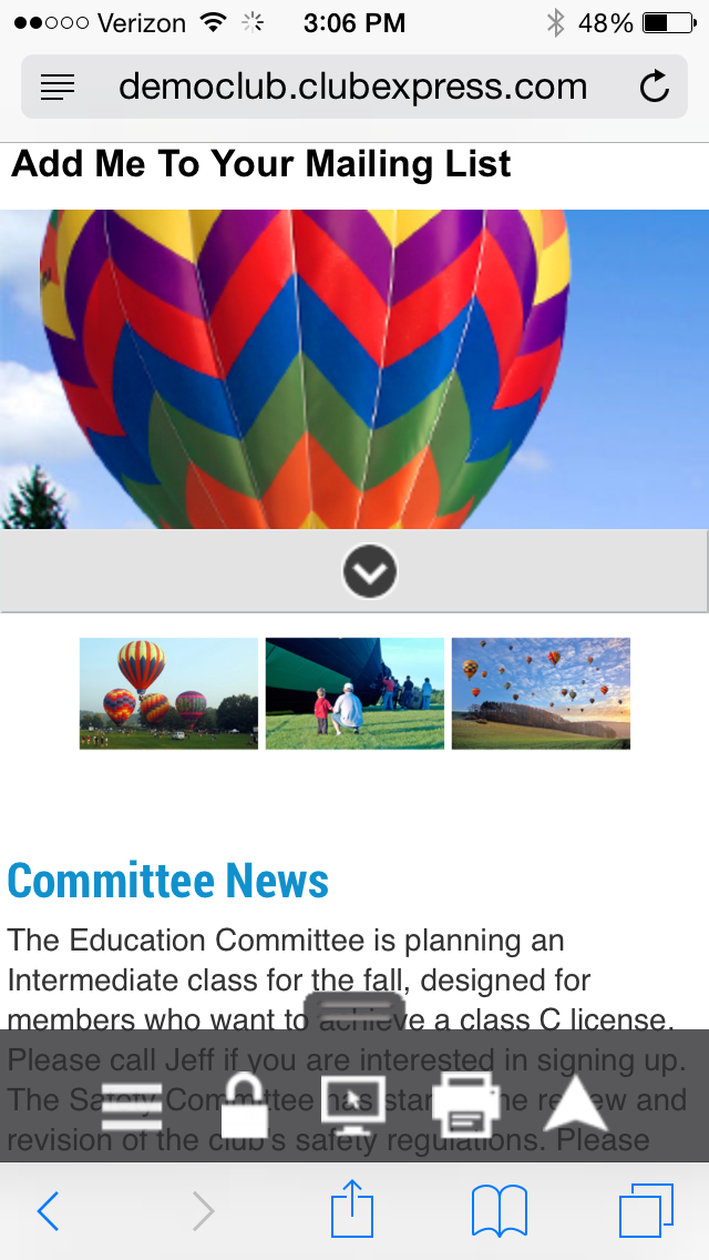
At the top is a standard link for non-members to add themselves to the club’s mailing list.
Below that is the page header. You can define a special header just for the mobile version of the website. If you don’t do this, you will see a portion of the club’s standard page header.
Below that is a “common content box”. This panel appears on every page but it is initially collapsed. Tap the down-arrow icon to expand it. The system allows you to define two of these content boxes, one at the top below the page header and a second just above the footer.
Next you will find the home page. As with the page header, ClubExpress allows you to define a special home page just for the mobile version of the website. If you don’t do this, the standard home page will be displayed but it may not be entirely suitable for use on a mobile device.
At the bottom of the screen, floating above the content is a standard toolbar with the following options:
| Icon | Description |
|---|---|
 (Menu) (Menu) |
Tapping this icon displays the website menu. |
 (Login) (Login) |
Tapping this icon allows you to login to the website. |
 (Profile) (Profile) |
When you are logged in, the Login icon changes to this one. Tapping it displays your individual Profile menu. |
 (Full site) (Full site) |
Tapping this icon allows you to switch to the full website. While this may not make a lot of sense on a smartphone, it’s certainly feasible on a tablet, many of which have a similar resolution to a desktop or laptop computer. If you switch to the full site, this toolbar is still visible and this icon changes to a different one that allows you to toggle back to the mobile site. |
 (Print) (Print) |
Tapping this icon allows you to print the current screen on any printer to which your mobile device is connected (for example, through Apple AirPrint.) Note that printing support is quite spotty on mobile devices. |
 (To Top) (To Top) |
Tap this icon to jump back to the top of the screen. |
Note that the overall look and feel for the mobile website is the same for all clubs and associations. It does not depend on the Website Look and Feel that you have configured for the main website. But you can customize the general appearance of the mobile site by using a special page header.
 Menus
Menus
When you tap the Menu icon, you will see a popup menu similar to the following:
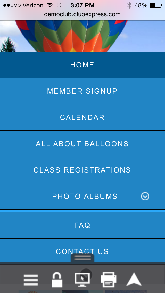
Tap a menu choice or tap the icon again to hide the menu. For submenus on a smartphone, tap the down arrow and the submenu will appear inline with the main menu. (On tablets, the submenu will appear to the side.)
As with the main site, the menu will different for the public vs. members, and may even be different for different member types.
Logging in
When you tap the Login icon, you will see a screen similar to the following:
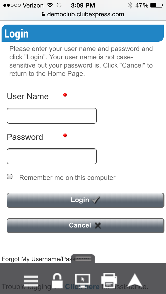
Enter your username and password then tap the Login button to complete the login process. Or tap Cancel to cancel out and return to the previous screen. As with the main website, you can tap the Remember me option to have the system remember you on this device, so that you don’t need to explicitly login each time. But you should never select this option on a device that you share with other people (such as a tablet at your local public library.)
Member Profile
Once you have logged in, tap the Profile icon to display the following screen:
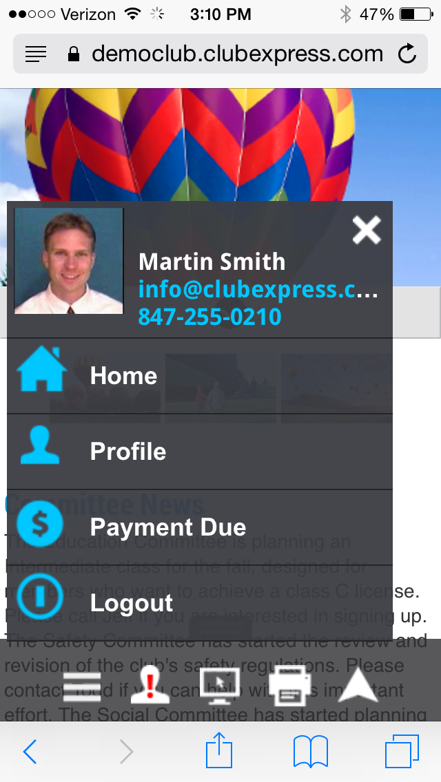
This popup menu allows you to jump to the home page, view your Profile screen or Logout. If you currently owe money, you will also see a Payment Due option and if your club or association is using the E-Commerce Storefront and you have placed items in your shopping cart, you will see a Shopping Cart option as well.
Other Screen Changes
Changes have been made to various ClubExpress modules and special functions to better accommodate mobile devices.
Example: Here is the Event Calendar:
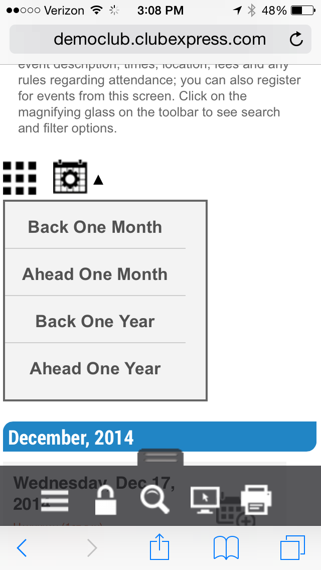
The icons at the top allow you to switch between views and also to navigate forward and backward within the calendar. The default mobile view is List but you can switch to the grid view if you want.
A small number of screens are best viewed in landscape mode rather that portrait (for example, the Document Library screen and the Payment page.) For these screens, if you are portrait mode, you will see a message asking you to rotate your device into landscape mode before the page content will appear.
Other Changes
For administrators and coordinators, all module and club level administration screens are disabled when you’re on a mobile device using the mobile layout. You cannot switch into the admin side of a module and you cannot display the Control Panel.
Note however that you can switch from the mobile site over to the full site, where admin screens are available. This may make sense on a tablet but we don’t recommend it on a smartphone.
ClubExpress now allows you to create special mobile versions of your Custom Web Pages, the static pages that make up much of the website. We strongly encourage you to do this, in order to make your website more accessible to people using a mobile device.
And, as noted in Accessing a ClubExpress Site on a Mobile Device, you can also create mobile-specific versions of your page header, home page, and 2 content boxes, to make them more appropriate for mobile devices.
Note: This mobile functionality is not available if your club or association is still using our old template/theme system for controlling the look and feel of your website. We strongly recommend that you convert to the new “Website Look and Feel” architecture to take advantage of these new features.